Nordstrom - Loyalty Evolution
This project was an overhaul of the entire Nordstrom Rewards program. My roll on this project was to create an MVP of the new program dashboard in such a way that illustrated the new program features, increased earn rate and benefits transparency for Nordstrom customers, boosted enrollment into the program (by making benefits more accessible), and encouraged engagement with the program and the Nordstrom brand.

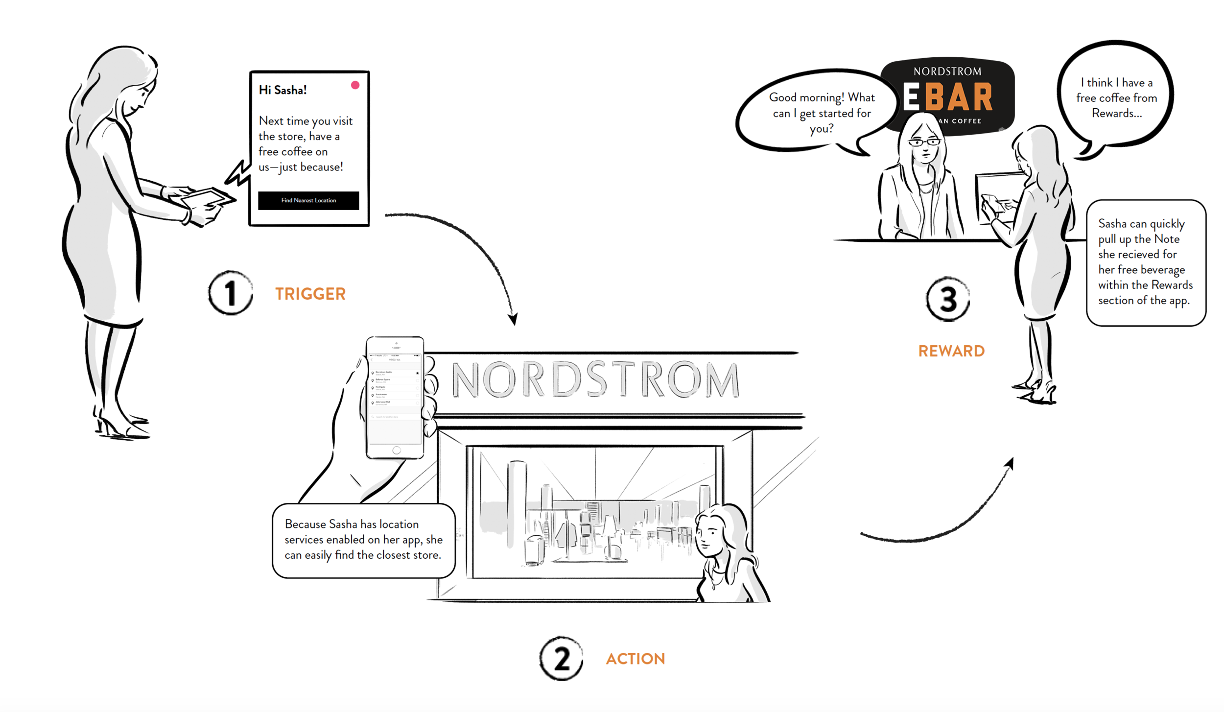
Due to the ambiguous nature of working with Program Design as they were creating this new set of features, I started this project with some storyboards. This allowed our team to substantiate ideas that were coming from our brainstorming meetings to better articulate our direction with leadership.


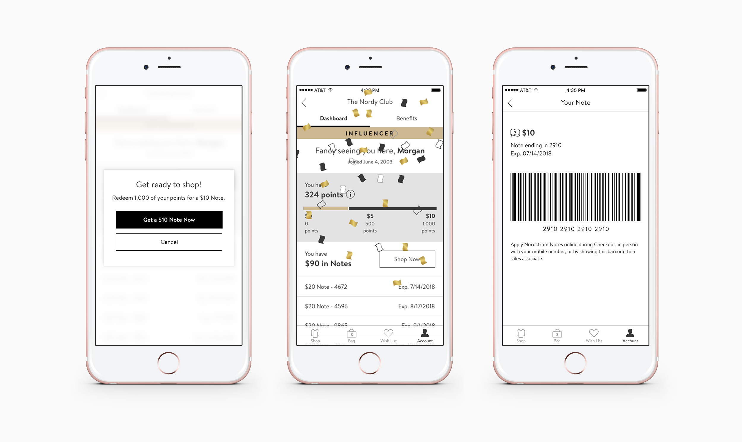
There were several goals for the Loyalty Evolution project that created interesting design challenges. One of those goals was to create more accessibility for lower-spending customers to earn Nordstrom Notes. We needed a way to show that you could opt to exchange points for Notes before reaching 2,000 (which used to issue an automatic $20 Note, but was somewhat unattainable for lower-spending customers).

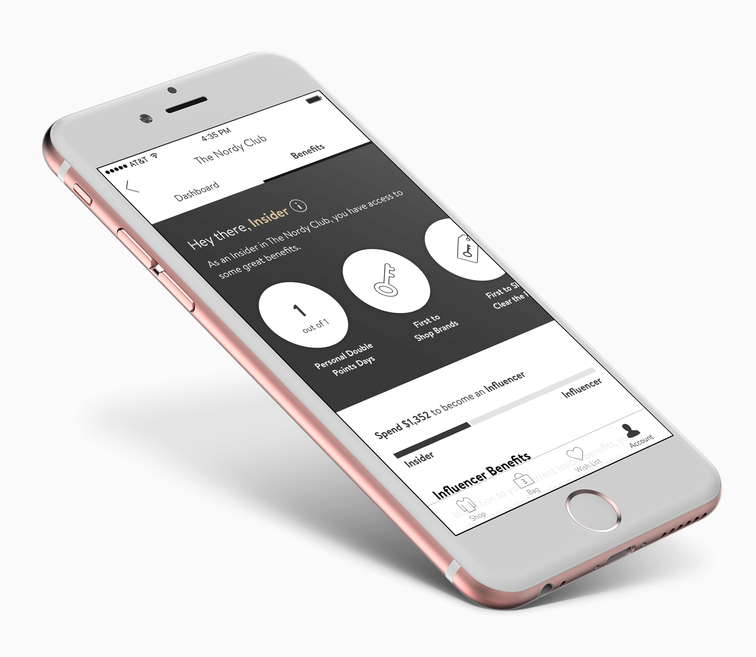
In addition to the new Loyalty dashboard, we wanted to address customer pain points around knowing what their supplemental benefits were, and how to use them, as well as helping our users to understand what rewards level they’re at and how to move up.

The UX process I used during this project included:
Brainstorming Sessions
Personas
Storyboarding
Journey Mapping
Creating Concept Cars
User Flows
Wireframing
Prototyping
Usability Testing (both in person and remote)
If you would like to learn more, please reach out via my contact page.